
ASTRO
Concept
Space App


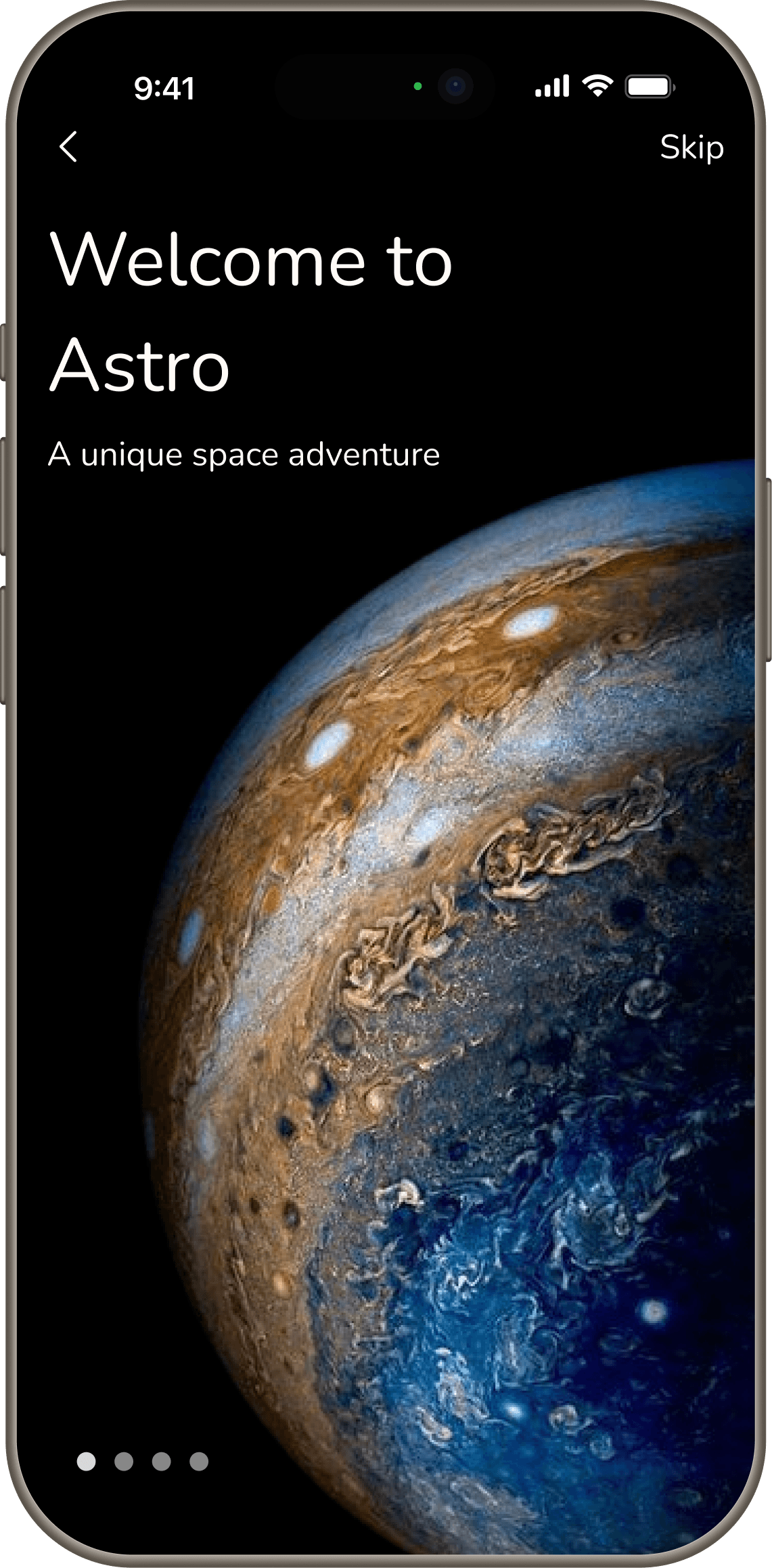
ASTRO
Concept
Space App
ASTRO
Concept
Space App

SOLAR SYSTEM
CONSTELLATION
COMETS
GALAXIES
NEBULA
SATELLITES
SOLAR SYSTEM
CONSTELLATION
COMETS
GALAXIES
NEBULA
SATELLITES
SOLAR SYSTEM
CONSTELLATION
COMETS
GALAXIES
NEBULA
SATELLITES
My Role
UI/UX Designer
Timeline
6 weeks
Tools Used
Figma,Notion,Google Forms
Platform
Mobile
Overview
Problem
People are genuinely curious about space, but existing platforms punish that curiosity.
Space content today is scattered across YouTube, Instagram, Reddit, and Wikipedia. There's no single place that catches curiosity and holds it. When users do try to explore, they're met with walls of text, scientific jargon, and no clear path forward, so they give up.
The problem isn't a lack of space content. It's that space content is impossible to explore casually.
Key Issues Identified
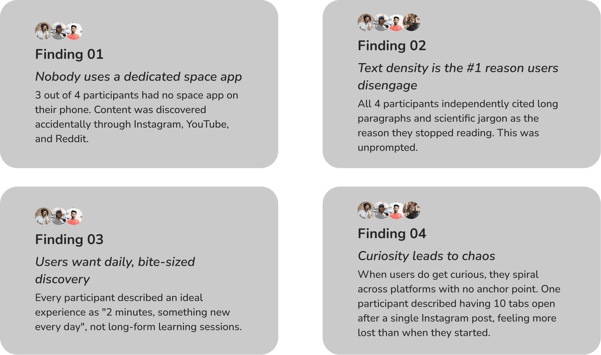
01 - Information Overload, Not Information Scarcity : Users don't struggle to find space content, they struggle to navigate it. In research, one participant described opening 10 tabs after a single Instagram post and leaving more confused than when they started.
02 - Text-Heavy Platforms Kill Curiosity : 4 out of 4 users interviewed cited information density as the primary reason they disengaged. Existing platforms prioritize scientific completeness over readability, making casual exploration feel like homework.
03 - Space Content is Consumed Reactively, Not Proactively : 3 out of 4 users had no dedicated space app on their phone. They encountered space content accidentally through social feeds and had nowhere meaningful to go when curiosity struck.
04 - No Platform Balances Wonder with Learning : Users consistently asked for something that "makes space feel exciting" rather than intimidating. The emotional gap between curiosity and confidence is what existing apps fail to bridge.
The Opportunity:
There's a clear gap in the market for an app that meets users at the moment curiosity strikes and holds their attention without overwhelming them.
Users don't want a textbook. They want a two-minute daily experience that makes space feel accessible, visual, and alive. As one research participant put it:
“I don't need more information. I need information that's easier to explore.”
Solution
Astro is a mobile-first space exploration platform designed to make astronomy feel approachable, immersive, and engaging for modern users. The app combines planetary exploration, space news, celestial events, and educational content into one calm, visually curated experience.
Rather than overwhelming users with information, Astro focuses on guided discovery and intuitive navigation, helping users explore space in a way that feels exciting instead of intimidating.
The experience is designed to transform passive curiosity into an ongoing habit of exploration.
High-Level Goals
Make Space Exploration Feel Accessible : Simplify complex information through intuitive layouts, guided content, and beginner-friendly experiences that reduce cognitive overload.
Create an Emotionally Immersive Experience : Use visual storytelling, motion, and atmospheric design to make learning about space feel calming, inspiring, and memorable.
Centralize Discovery in One Ecosystem : Bring together news, celestial events, educational videos, and exploration tools into a unified experience that reduces platform switching.
Encourage Long-Term Curiosity : Design exploration flows that continuously reward users with new discoveries, encouraging repeat engagement and deeper interest in astronomy.
My Approach
01
Research
Understanding user frustrations, motivations, existing behaviors, and gaps within current astronomy platforms.
02
Design
Exploring navigation systems, content structures, interaction patterns, and immersive visual experiences through iterative ideation.
03
Evaluate
Refining the experience through feedback, usability observations, and continuous iteration to improve clarity and engagement.
Key Issues Identified
01 - Information Overload, Not Information Scarcity : Users don't struggle to find space content, they struggle to navigate it. In research, one participant described opening 10 tabs after a single Instagram post and leaving more confused than when they started.
02 - Text-Heavy Platforms Kill Curiosity : 4 out of 4 users interviewed cited information density as the primary reason they disengaged. Existing platforms prioritize scientific completeness over readability, making casual exploration feel like homework.
03 - Space Content is Consumed Reactively, Not Proactively : 3 out of 4 users had no dedicated space app on their phone. They encountered space content accidentally through social feeds and had nowhere meaningful to go when curiosity struck.
04 - No Platform Balances Wonder with Learning : Users consistently asked for something that "makes space feel exciting" rather than intimidating. The emotional gap between curiosity and confidence is what existing apps fail to bridge.
My Role
UI/UX Designer
Timeline
6 weeks
Tools Used
Figma,Notion,Google Forms
Platform
Mobile
Problem
People are genuinely curious about space, but existing platforms punish that curiosity.
Space content today is scattered across YouTube, Instagram, Reddit, and Wikipedia. There's no single place that catches curiosity and holds it. When users do try to explore, they're met with walls of text, scientific jargon, and no clear path forward, so they give up.
The problem isn't a lack of space content. It's that space content is impossible to explore casually.
Overview
The Opportunity:
There's a clear gap in the market for an app that meets users at the moment curiosity strikes and holds their attention without overwhelming them.
Users don't want a textbook. They want a two-minute daily experience that makes space feel accessible, visual, and alive. As one research participant put it:
“I don't need more information. I need information that's easier to explore.”
Solution
Astro is a mobile-first space exploration platform designed to make astronomy feel approachable, immersive, and engaging for modern users. The app combines planetary exploration, space news, celestial events, and educational content into one calm, visually curated experience.
Rather than overwhelming users with information, Astro focuses on guided discovery and intuitive navigation, helping users explore space in a way that feels exciting instead of intimidating.
The experience is designed to transform passive curiosity into an ongoing habit of exploration.
High-Level Goals
Make Space Exploration Feel Accessible : Simplify complex information through intuitive layouts, guided content, and beginner-friendly experiences that reduce cognitive overload.
Create an Emotionally Immersive Experience : Use visual storytelling, motion, and atmospheric design to make learning about space feel calming, inspiring, and memorable.
Centralize Discovery in One Ecosystem : Bring together news, celestial events, educational videos, and exploration tools into a unified experience that reduces platform switching.
Encourage Long-Term Curiosity : Design exploration flows that continuously reward users with new discoveries, encouraging repeat engagement and deeper interest in astronomy.
My Approach
01
Research
Understanding user frustrations, motivations, existing behaviors, and gaps within current astronomy platforms.
02
Design
Exploring navigation systems, content structures, interaction patterns, and immersive visual experiences through iterative ideation.
03
Evaluate
Refining the experience through feedback, usability observations, and continuous iteration to improve clarity and engagement.
My Role
UI/UX Designer
Timeline
6 weeks
Tools Used
Figma,Notion,Google Forms
Platform
Mobile
Overview
Problem
People are genuinely curious about space, but existing platforms punish that curiosity.
Space content today is scattered across YouTube, Instagram, Reddit, and Wikipedia. There's no single place that catches curiosity and holds it. When users do try to explore, they're met with walls of text, scientific jargon, and no clear path forward, so they give up.
The problem isn't a lack of space content. It's that space content is impossible to explore casually.
Key Issues Identified
01 - Information Overload, Not Information Scarcity : Users don't struggle to find space content, they struggle to navigate it. In research, one participant described opening 10 tabs after a single Instagram post and leaving more confused than when they started.
02 - Text-Heavy Platforms Kill Curiosity : 4 out of 4 users interviewed cited information density as the primary reason they disengaged. Existing platforms prioritize scientific completeness over readability, making casual exploration feel like homework.
03 - Space Content is Consumed Reactively, Not Proactively : 3 out of 4 users had no dedicated space app on their phone. They encountered space content accidentally through social feeds and had nowhere meaningful to go when curiosity struck.
04 - No Platform Balances Wonder with Learning : Users consistently asked for something that "makes space feel exciting" rather than intimidating. The emotional gap between curiosity and confidence is what existing apps fail to bridge.
The Opportunity:
There's a clear gap in the market for an app that meets users at the moment curiosity strikes and holds their attention without overwhelming them.
Users don't want a textbook. They want a two-minute daily experience that makes space feel accessible, visual, and alive. As one research participant put it:
“I don't need more information. I need information that's easier to explore.”
Solution
Astro is a mobile-first space exploration platform designed to make astronomy feel approachable, immersive, and engaging for modern users. The app combines planetary exploration, space news, celestial events, and educational content into one calm, visually curated experience.
Rather than overwhelming users with information, Astro focuses on guided discovery and intuitive navigation, helping users explore space in a way that feels exciting instead of intimidating.
The experience is designed to transform passive curiosity into an ongoing habit of exploration.
High-Level Goals
Make Space Exploration Feel Accessible : Simplify complex information through intuitive layouts, guided content, and beginner-friendly experiences that reduce cognitive overload.
Create an Emotionally Immersive Experience : Use visual storytelling, motion, and atmospheric design to make learning about space feel calming, inspiring, and memorable.
Centralize Discovery in One Ecosystem : Bring together news, celestial events, educational videos, and exploration tools into a unified experience that reduces platform switching.
Encourage Long-Term Curiosity : Design exploration flows that continuously reward users with new discoveries, encouraging repeat engagement and deeper interest in astronomy.
My Approach
01
Research
Understanding user frustrations, motivations, existing behaviors, and gaps within current astronomy platforms.
02
Design
Exploring navigation systems, content structures, interaction patterns, and immersive visual experiences through iterative ideation.
03
Evaluate
Refining the experience through feedback, usability observations, and continuous iteration to improve clarity and engagement.

A space adventure



User Interviews
To validate my assumptions, I conducted informal interviews with 4 participants who have a real interest in space.
Research

Competitive Analysis
Before designing Astro, I spent time actually using existing space apps to understand where they fail casual users, specifically around information density, discoverability, and daily engagement.
The Gap - What None of Them Do
After analyzing all four apps, one pattern was clear:
Every existing app does one thing well and fails at everything else.
NASA has depth but no accessibility
Star Walk 2 has visuals but no breadth
Stellarium has immersion but no daily hook
No app combines visual immersion, beginner-friendly content, bite-sized daily discovery, and genuine explorability in one place.
That gap is exactly where Astro lives.
Key Findings


Hero Quotes

A space adventure


User Interviews
To validate my assumptions, I conducted informal interviews with 4 participants who have a real interest in space.
Research
Hero Quotes

Competitive Analysis
Before designing Astro, I spent time actually using existing space apps to understand where they fail casual users, specifically around information density, discoverability, and daily engagement.
The Gap - What None of Them Do
After analyzing all four apps, one pattern was clear:
Every existing app does one thing well and fails at everything else.
NASA has depth but no accessibility
Star Walk 2 has visuals but no breadth
Stellarium has immersion but no daily hook
No app combines visual immersion, beginner-friendly content, bite-sized daily discovery, and genuine explorability in one place.
That gap is exactly where Astro lives.
Key Findings

User Persona

Design Implications
Text-heavy content → card-based summaries with progressive disclosure
Reactive consumption pattern → daily discovery feature with push notifications
Intimidated by scientific language → plain language first, technical detail on demand
Needs emotional hook → lead with wonder, not data
User Persona
Design Implications
Text-heavy content → card-based summaries with progressive disclosure
Reactive consumption pattern → daily discovery feature with push notifications
Intimidated by scientific language → plain language first, technical detail on demand
Needs emotional hook → lead with wonder, not data
User Interviews
To validate my assumptions, I conducted informal interviews with 4 participants who have a real interest in space.
Research

Hero Quotes

Key Findings

Competitive Analysis
Before designing Astro, I spent time actually using existing space apps to understand where they fail casual users, specifically around information density, discoverability, and daily engagement.
The Gap - What None of Them Do
After analyzing all four apps, one pattern was clear:
Every existing app does one thing well and fails at everything else.
NASA has depth but no accessibility
Star Walk 2 has visuals but no breadth
Stellarium has immersion but no daily hook
No app combines visual immersion, beginner-friendly content, bite-sized daily discovery, and genuine explorability in one place.
That gap is exactly where Astro lives.
User Persona
Design Implications
Text-heavy content → card-based summaries with progressive disclosure
Reactive consumption pattern → daily discovery feature with push notifications
Intimidated by scientific language → plain language first, technical detail on demand
Needs emotional hook → lead with wonder, not data
Information Architecture
With higher-level goals and opportunity areas in mind, I defined Astro’s product structure.

Information Architecture
With higher-level goals and opportunity areas in mind, I defined Astro’s product structure.

Information Architecture
With higher-level goals and opportunity areas in mind, I defined Astro’s product structure.

Iteration Story
After identifying user needs and pain points, I began brainstorming features that could simplify space exploration and create a more engaging learning experience.
Final Direction - Modular Card Layout

Why this works :
The final direction introduced a modular card-based layout that allowed content to be grouped into digestible sections while maintaining a visually immersive experience.
Larger imagery and improved spacing created clearer hierarchy, helping users quickly scan and explore topics based on interest.
The card system also increased flexibility and scalability for future content additions.
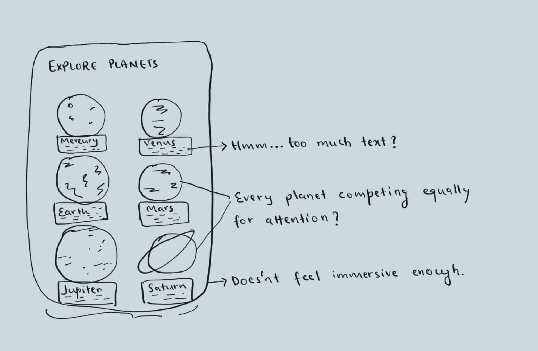
Exploration 2 - Planet Exploration Screen
Informative
BUT
Visually dead

Problems :
The layout resembled a catalog rather than an immersive discovery experience.
Too much simultaneous information increased cognitive load and reduced visual focus.
Since every planet was visually identical, users lacked a clear focal point while browsing.
Early Decisions
After identifying user needs and pain points, I began brainstorming features that could simplify space exploration and create a more engaging learning experience.

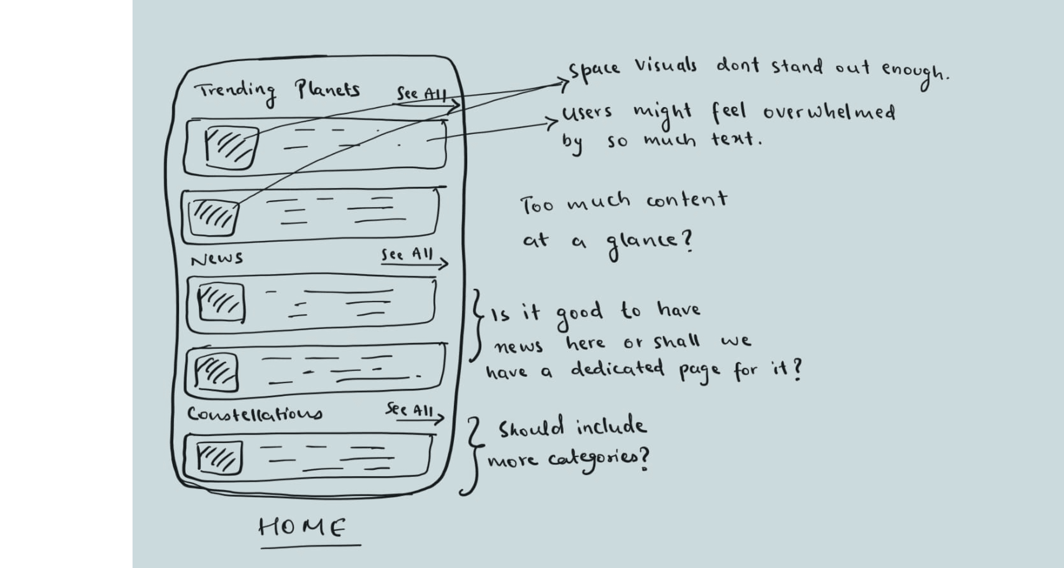
Exploration 1 - Home page

Problems :
Users struggled to identify where to focus first because every section had similar visual weight.
Surfacing too much information at once made the experience feel dense and harder to scan quickly.
The smaller visual elements weakened the atmospheric and exploratory feeling
Final Direction - Floating planets

Why this works :
Information was progressively revealed only after selection, reducing clutter thus creating a more immersive experience.
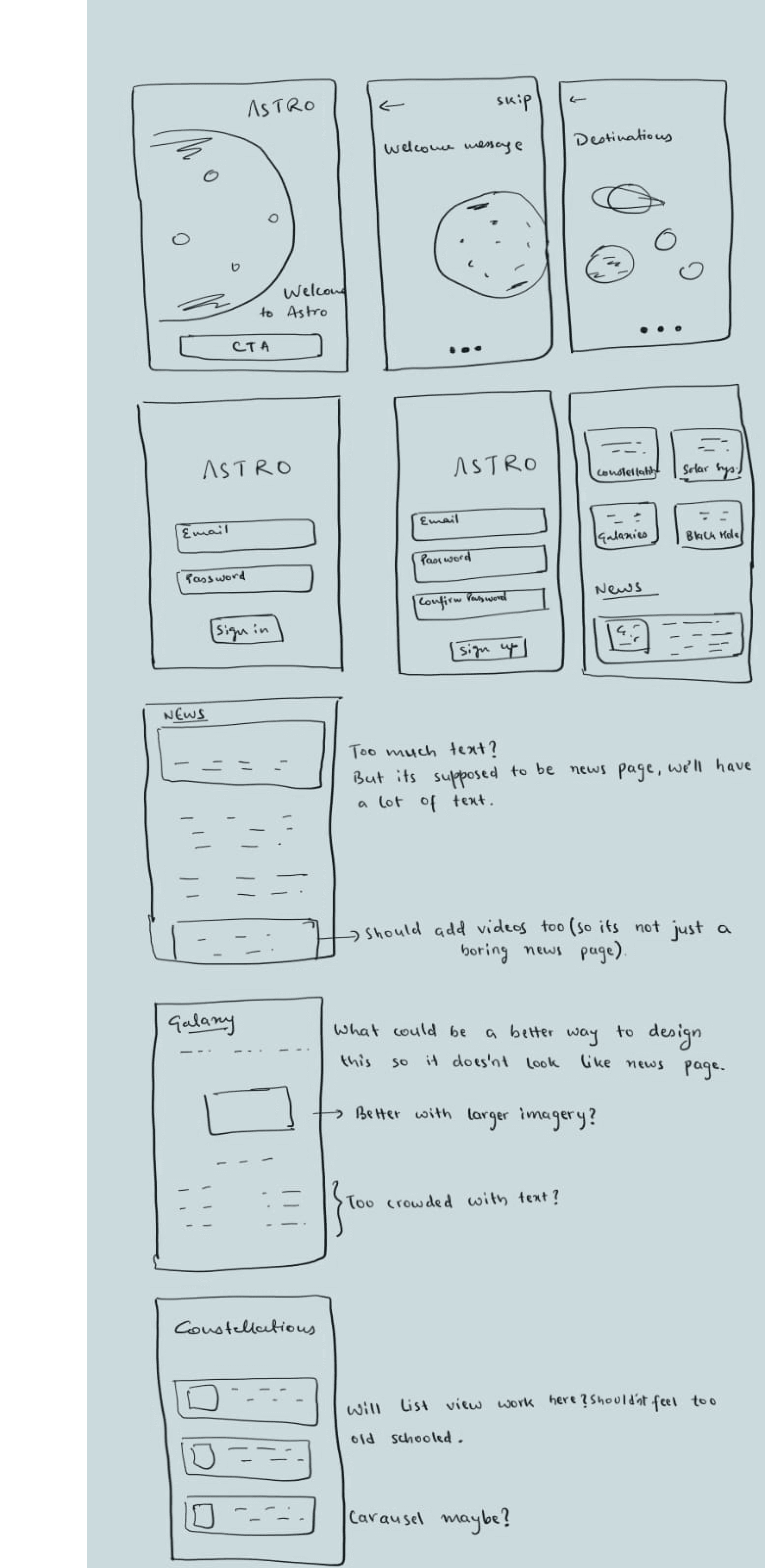
More Sketches & Messy Thoughts
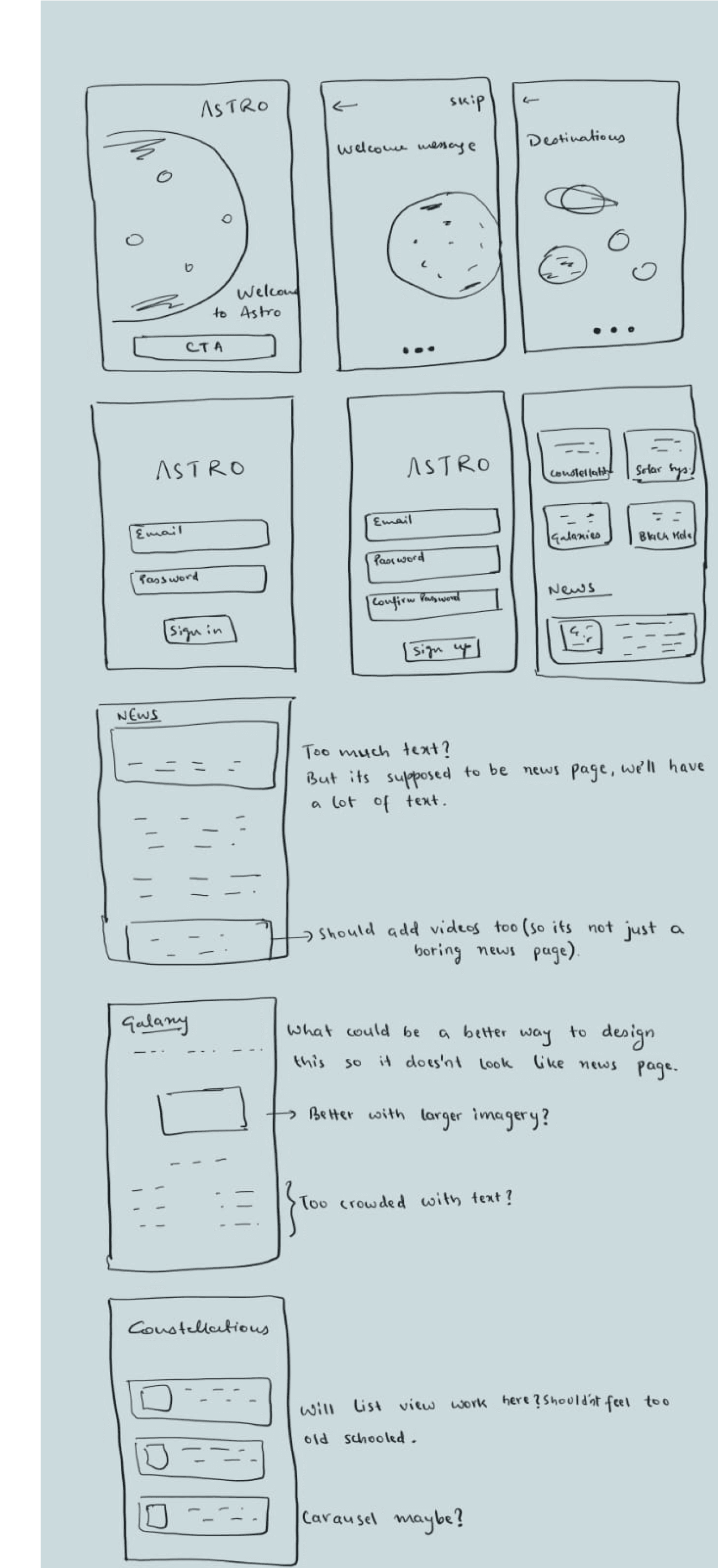
Key Design Decisions
Decision 01 - Floating Planets vs. Grid Layout
The insight that drove this: Research showed users felt overwhelmed by information-dense screens. A grid layout felt like a catalog, organized but clinical. It removed the sense of scale that makes space feel wondrous.
What I explored: Grid view vs. floating spatial layout.
What I chose and why: The floating layout. In competitive analysis, Star Walk proved that spatial context dramatically increases emotional engagement with planetary content. A grid turns planets into data points. A floating layout preserves their identity.
Decision 02 - Progressive Disclosure for Planet Information
The insight that drove this: 4 out of 4 users said information density was why they stopped reading. But users also said they wanted to learn, they just didn't want to be forced to read everything at once.
What I explored: Full information on one screen vs. layered reveal (tap to reveal).
What I chose and why: Progressive disclosure. Show the visual and one headline fact first. Let the user decide how deep to go. This respects the "two minute" user while still serving the curious user who wants more.
Decision 03 - Daily News Card Format
The insight that drove this: Users said they'd come back daily for short, visual content. P3 specifically said "two minutes and learn something new." This shaped the entire news section format.
What I explored: Article-style news feed vs. card-based daily digest.
What I chose and why: Cards with bold imagery, one headline, and a 2-line summary. The full article is available behind a tap, but the card alone should be satisfying. Think Instagram but for space news.
Decision 04 - Galaxies screen
The Galaxies section was deliberately kept as a list format in this version due to time constraints but this is the screen I'm least satisfied with and would redesign first.
Iteration Story
After identifying user needs and pain points, I began brainstorming features that could simplify space exploration and create a more engaging learning experience.
Final Direction - Modular Card Layout

Why this works :
The final direction introduced a modular card-based layout that allowed content to be grouped into digestible sections while maintaining a visually immersive experience.
Larger imagery and improved spacing created clearer hierarchy, helping users quickly scan and explore topics based on interest.
The card system also increased flexibility and scalability for future content additions.
Exploration 2 - Planet Exploration Screen
Informative
BUT
Visually dead
Problems :
The layout resembled a catalog rather than an immersive discovery experience.
Too much simultaneous information increased cognitive load and reduced visual focus.
Since every planet was visually identical, users lacked a clear focal point while browsing.
Early Decisions
After identifying user needs and pain points, I began brainstorming features that could simplify space exploration and create a more engaging learning experience.
Exploration 1 - Home page

Problems :
Users struggled to identify where to focus first because every section had similar visual weight.
Surfacing too much information at once made the experience feel dense and harder to scan quickly.
The smaller visual elements weakened the atmospheric and exploratory feeling
Final Direction - Floating planets

Why this works :
Information was progressively revealed only after selection, reducing clutter thus creating a more immersive experience.
More Sketches & Messy Thoughts

Key Design Decisions
Decision 01 - Floating Planets vs. Grid Layout
The insight that drove this: Research showed users felt overwhelmed by information-dense screens. A grid layout felt like a catalog, organized but clinical. It removed the sense of scale that makes space feel wondrous.
What I explored: Grid view vs. floating spatial layout.
What I chose and why: The floating layout. In competitive analysis, Star Walk proved that spatial context dramatically increases emotional engagement with planetary content. A grid turns planets into data points. A floating layout preserves their identity.
Decision 02 - Progressive Disclosure for Planet Information
The insight that drove this: 4 out of 4 users said information density was why they stopped reading. But users also said they wanted to learn, they just didn't want to be forced to read everything at once.
What I explored: Full information on one screen vs. layered reveal (tap to reveal).
What I chose and why: Progressive disclosure. Show the visual and one headline fact first. Let the user decide how deep to go. This respects the "two minute" user while still serving the curious user who wants more.
Decision 03 - Daily News Card Format
The insight that drove this: Users said they'd come back daily for short, visual content. P3 specifically said "two minutes and learn something new." This shaped the entire news section format.
What I explored: Article-style news feed vs. card-based daily digest.
What I chose and why: Cards with bold imagery, one headline, and a 2-line summary. The full article is available behind a tap, but the card alone should be satisfying. Think Instagram but for space news.
Decision 04 - Galaxies screen
The Galaxies section was deliberately kept as a list format in this version due to time constraints but this is the screen I'm least satisfied with and would redesign first.
Iteration Story
After identifying user needs and pain points, I began brainstorming features that could simplify space exploration and create a more engaging learning experience.
Final Direction - Modular Card Layout

Why this works :
The final direction introduced a modular card-based layout that allowed content to be grouped into digestible sections while maintaining a visually immersive experience.
Larger imagery and improved spacing created clearer hierarchy, helping users quickly scan and explore topics based on interest.
The card system also increased flexibility and scalability for future content additions.
Exploration 2 - Planet Exploration Screen
Informative
BUT
Visually dead

Problems :
The layout resembled a catalog rather than an immersive discovery experience.
Too much simultaneous information increased cognitive load and reduced visual focus.
Since every planet was visually identical, users lacked a clear focal point while browsing.
Early Decisions
After identifying user needs and pain points, I began brainstorming features that could simplify space exploration and create a more engaging learning experience.
Exploration 1 - Home page
Problems :
Users struggled to identify where to focus first because every section had similar visual weight.
Surfacing too much information at once made the experience feel dense and harder to scan quickly.
The smaller visual elements weakened the atmospheric and exploratory feeling
Final Direction - Floating planets

Why this works :
Information was progressively revealed only after selection, reducing clutter thus creating a more immersive experience.
More Sketches & Messy Thoughts
Key Design Decisions
Decision 01 - Floating Planets vs. Grid Layout
The insight that drove this: Research showed users felt overwhelmed by information-dense screens. A grid layout felt like a catalog, organized but clinical. It removed the sense of scale that makes space feel wondrous.
What I explored: Grid view vs. floating spatial layout.
What I chose and why: The floating layout. In competitive analysis, Star Walk proved that spatial context dramatically increases emotional engagement with planetary content. A grid turns planets into data points. A floating layout preserves their identity.
Decision 02 - Progressive Disclosure for Planet Information
The insight that drove this: 4 out of 4 users said information density was why they stopped reading. But users also said they wanted to learn, they just didn't want to be forced to read everything at once.
What I explored: Full information on one screen vs. layered reveal (tap to reveal).
What I chose and why: Progressive disclosure. Show the visual and one headline fact first. Let the user decide how deep to go. This respects the "two minute" user while still serving the curious user who wants more.
Decision 03 - Daily News Card Format
The insight that drove this: Users said they'd come back daily for short, visual content. P3 specifically said "two minutes and learn something new." This shaped the entire news section format.
What I explored: Article-style news feed vs. card-based daily digest.
What I chose and why: Cards with bold imagery, one headline, and a 2-line summary. The full article is available behind a tap, but the card alone should be satisfying. Think Instagram but for space news.
Decision 04 - Galaxies screen
The Galaxies section was deliberately kept as a list format in this version due to time constraints but this is the screen I'm least satisfied with and would redesign first.
Design System
Astro's visual language was designed to evoke the vastness and mystery of space while maintaining readability and focus. A restrained dark palette, subtle accent colors, and minimal interface elements were used to keep celestial imagery as the primary visual focus.
Colors
Typography
Heading 1 / 48px
Heading / 40px
Heading 2 / 24px
Heading 3 / 18px
Body 1 / 16px
Body 2 / 14px
Body 3 / 12px


Navigation
Explore
Updates
Profile
Explore
Updates
Profile
Explore
Updates
Profile
Design System
Astro's visual language was designed to evoke the vastness and mystery of space while maintaining readability and focus. A restrained dark palette, subtle accent colors, and minimal interface elements were used to keep celestial imagery as the primary visual focus.
Colors
Typography
Heading 1 / 48px
Heading / 40px
Heading 2 / 24px
Heading 3 / 18px
Body 1 / 16px
Body 2 / 14px
Body 3 / 12px
Navigation
Explore
Updates
Profile
Explore
Updates
Profile
Explore
Updates
Profile
Design System
Astro's visual language was designed to evoke the vastness and mystery of space while maintaining readability and focus. A restrained dark palette, subtle accent colors, and minimal interface elements were used to keep celestial imagery as the primary visual focus.
Colors
Typography
Heading 1 / 48px
Heading / 40px
Heading 2 / 24px
Heading 3 / 18px
Body 1 / 16px
Body 2 / 14px
Body 3 / 12px

Navigation
Explore
Updates
Profile
Explore
Updates
Profile
Explore
Updates
Profile
Final UI

ONBOARDING SCREENS

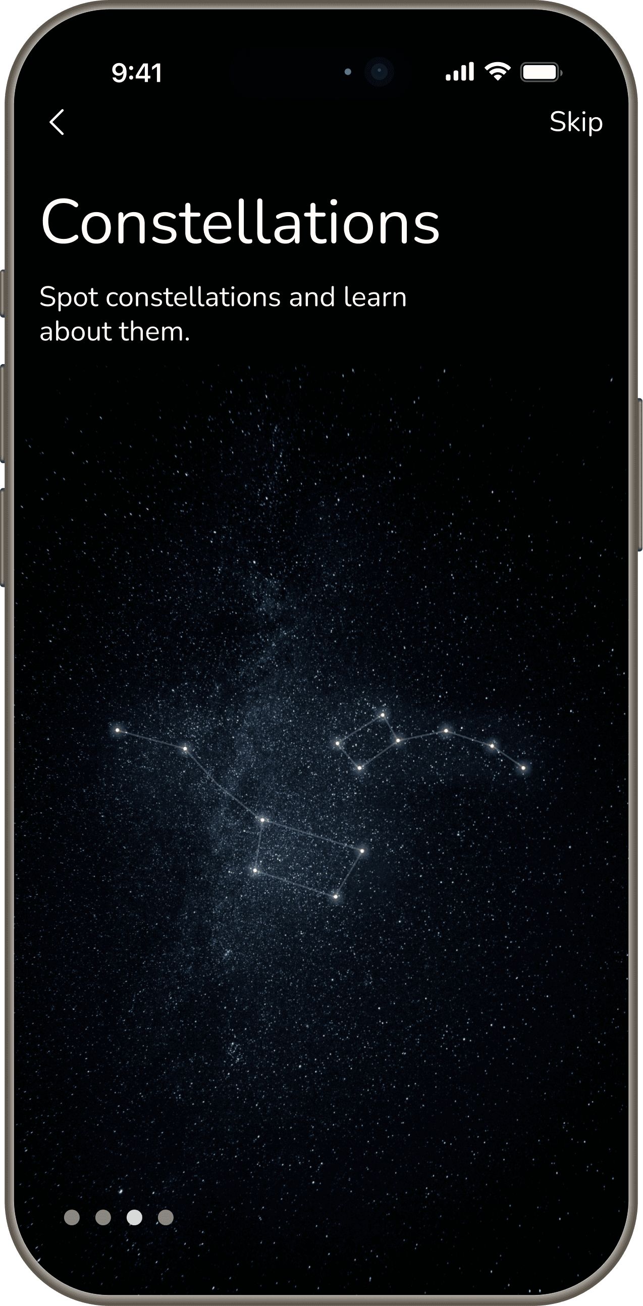


HOME SCREENS
Visual-First Discovery
Large imagery creates an immersive first impression and encourages exploration through curiosity rather than technical content.


Mercury

Venus

Earth

Moon
Mars

Jupiter

Saturn
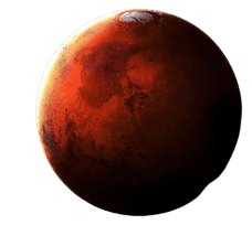
Choose your destination
9:41
DISCOVER PLANETS
Users can drag through the solar system and select a planet to learn more about it.
Each planet serves as an entry point to a dedicated detail page containing facts, interactive hotspots, and related discoveries.


Final UI
ONBOARDING SCREENS
Visual-First Discovery
Large imagery creates an immersive first impression and encourages exploration through curiosity rather than technical content.
HOME SCREENS

DISCOVER PLANETS
Users can drag through the solar system and select a planet to learn more about it.
Each planet serves as an entry point to a dedicated detail page containing facts, interactive hotspots, and related discoveries.
Final UI
ONBOARDING SCREENS

Visual-First Discovery
Large imagery creates an immersive first impression and encourages exploration through curiosity rather than technical content.
HOME SCREENS
DISCOVER PLANETS
Users can drag through the solar system and select a planet to learn more about it.
Each planet serves as an entry point to a dedicated detail page containing facts, interactive hotspots, and related discoveries.
ASTRONOMICAL UPDATES
Stay up to date with latest space news and events.


ASTRONOMICAL UPDATES
Stay up to date with latest space news and events.
ASTRONOMICAL UPDATES
Stay up to date with latest space news and events.

CONSTELLATIONS


CONSTELLATIONS

CONSTELLATIONS


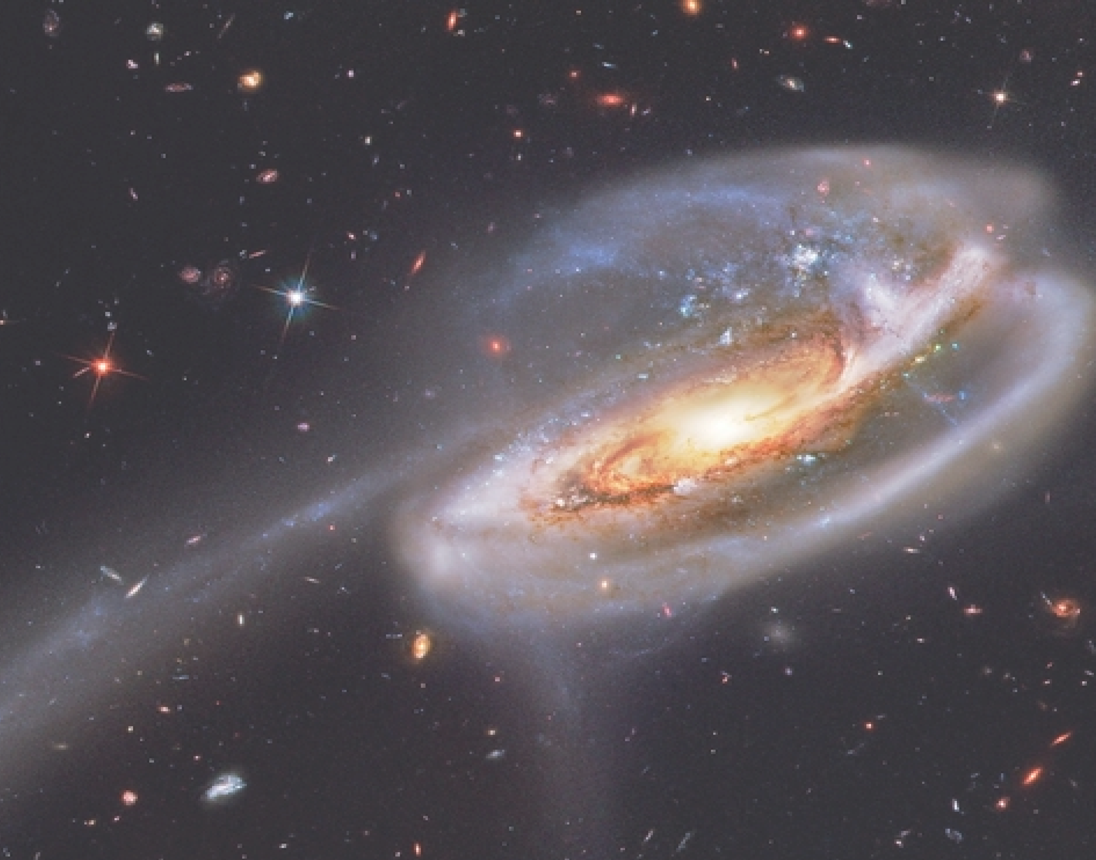
GALAXIES
Reflection
What I'd do with more time
The Galaxies screen is the one part of Astro I'm not fully satisfied with. Right now it's a list; functional but passive. It doesn't invite exploration the way the Planets screen does.
Given more time, I'd redesign it with the same spatial, visual-first logic applied elsewhere in the app, making galaxies feel as wondrous to browse as they are to look at.
I'd also explore personalization and gamification features, event reminders, daily space quizzes. Every user I spoke to said they'd return daily for something new. A quiz or challenge mechanic could be the habit loop that actually makes that happen.
What I'd do differently
Early in the process I prioritized visual appeal over content structure. My first version of the Updates screen looked beautiful but was difficult to scan, a user couldn't quickly tell what was important. I learned that strong visuals and clear information hierarchy aren't competing priorities. They have to work together, or the design fails the user even if it impresses them at first glance.
Given more time, I'd redesign it with the same spatial, visual-first logic applied elsewhere in the app, making galaxies feel as wondrous to browse as they are to look at.
I'd also explore event reminders and daily space quizzes. Every user I spoke to said they'd return daily for something new. A quiz or challenge mechanic could be the habit loop that actually makes that happen.
What this project taught me
Astro taught me that a great-looking interface is only the entry point. The real design work happens underneath in the decisions about what to show first, how much to reveal, and what to hold back.

Reflection
What I'd do with more time
The Galaxies screen is the one part of Astro I'm not fully satisfied with. Right now it's a list; functional but passive. It doesn't invite exploration the way the Planets screen does.
Given more time, I'd redesign it with the same spatial, visual-first logic applied elsewhere in the app, making galaxies feel as wondrous to browse as they are to look at.
I'd also explore personalization and gamification features, event reminders, daily space quizzes. Every user I spoke to said they'd return daily for something new. A quiz or challenge mechanic could be the habit loop that actually makes that happen.
What I'd do differently
Early in the process I prioritized visual appeal over content structure. My first version of the Updates screen looked beautiful but was difficult to scan, a user couldn't quickly tell what was important. I learned that strong visuals and clear information hierarchy aren't competing priorities. They have to work together, or the design fails the user even if it impresses them at first glance.
Given more time, I'd redesign it with the same spatial, visual-first logic applied elsewhere in the app, making galaxies feel as wondrous to browse as they are to look at.
I'd also explore event reminders and daily space quizzes. Every user I spoke to said they'd return daily for something new. A quiz or challenge mechanic could be the habit loop that actually makes that happen.
What this project taught me
Astro taught me that a great-looking interface is only the entry point. The real design work happens underneath in the decisions about what to show first, how much to reveal, and what to hold back.
Reflection
What I'd do with more time
The Galaxies screen is the one part of Astro I'm not fully satisfied with. Right now it's a list; functional but passive. It doesn't invite exploration the way the Planets screen does.
Given more time, I'd redesign it with the same spatial, visual-first logic applied elsewhere in the app, making galaxies feel as wondrous to browse as they are to look at.
I'd also explore personalization and gamification features, event reminders, daily space quizzes. Every user I spoke to said they'd return daily for something new. A quiz or challenge mechanic could be the habit loop that actually makes that happen.
What I'd do differently
Early in the process I prioritized visual appeal over content structure. My first version of the Updates screen looked beautiful but was difficult to scan, a user couldn't quickly tell what was important. I learned that strong visuals and clear information hierarchy aren't competing priorities. They have to work together, or the design fails the user even if it impresses them at first glance.
Given more time, I'd redesign it with the same spatial, visual-first logic applied elsewhere in the app, making galaxies feel as wondrous to browse as they are to look at.
I'd also explore event reminders and daily space quizzes. Every user I spoke to said they'd return daily for something new. A quiz or challenge mechanic could be the habit loop that actually makes that happen.
What this project taught me
Astro taught me that a great-looking interface is only the entry point. The real design work happens underneath in the decisions about what to show first, how much to reveal, and what to hold back.


THANK YOU FOR VISITING


THANK YOU FOR VISITING

THANK YOU FOR VISITING